CyberBlog | AI-Powered Business Blog Automation
https://www.cyberblogai.com
CyberBlog is your AI-powered blog automation tool that generates content for your blog, optimizes it for SEO, and publishes it to your blog.
Website Analysis Report
Comprehensive analysis of your website across multiple dimensions
Overall Score
Key Metrics Overview
Call to Action
SEO
Design
Content
Tagging
User Trust
Engagement
Navigation
Performance
Outbound Link
Accessibility
Domain Authority
Conversion Funnel
Image Optimization
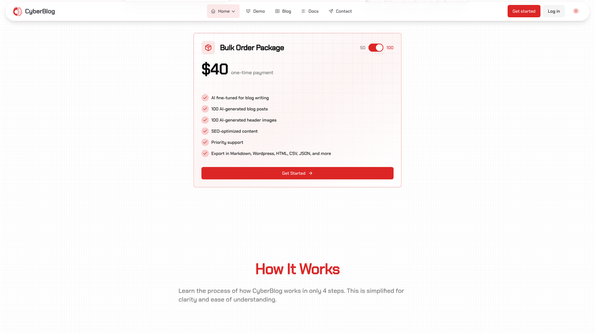
Call to Action
Evaluation of your website's call-to-actions
Metrics Analysis
ctaTextPersuasiveness
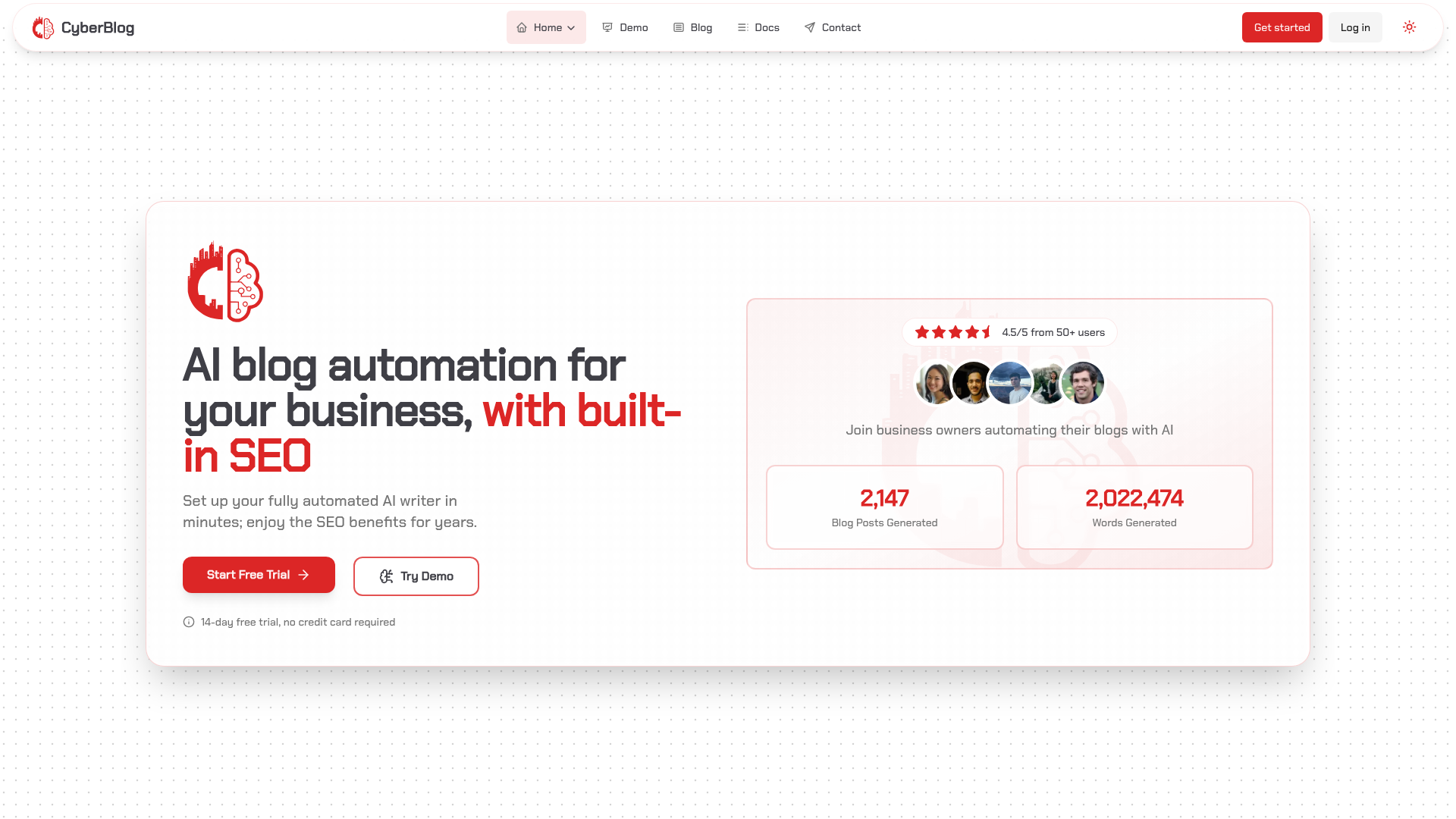
The CTA texts are clear and direct, using actionable language such as 'Start Free Trial', 'Try Demo', and 'Get Started', which are effective in communicating the intended next steps. The texts align well with the product's benefits and convey an inviting message. However, some of the CTA texts are somewhat generic and could benefit from more emotionally engaging or urgency-inducing language that emphasizes immediate benefits. Refining the copy to include value propositions or time-sensitive language could further boost their persuasiveness and conversion rates.
ctaPlacementVisibility
The CTA elements on the website are strategically positioned to capture user attention. Primary CTAs such as 'Start Free Trial', 'Try Demo', and other action-oriented buttons are prominently placed in the header and hero sections, ensuring that visitors immediately see options for engagement. Additionally, secondary CTAs throughout the site, like those in the bulk generation and pricing sections, help reinforce the conversion funnel. However, there is a slight risk of dilution due to the high number of CTAs which could lead to decision fatigue. Streamlining the layout by highlighting the most critical CTAs while keeping supportive actions available could further improve the user journey.
Recommendations
Reduce possible clutter by prioritizing the most important CTAs. Consider using visual hierarchy to distinguish between primary and secondary actions.
Enhance CTA text by integrating urgency or highlighting distinctive benefits. For instance, replace generic terms like 'Get Started' with phrases that evoke immediate value.
Perform A/B testing on different CTA placements and texts to evaluate their impact on engagement and conversion rates.
Ensure consistency in design and clear contrasts between CTA buttons and background elements to further improve visibility and encourage user interaction.
SEO
Evaluation of your website's search engine optimization
Metrics Analysis
headerTagHierarchy
The website makes good use of header tags with a strong, descriptive H1 followed by logically structured H2 and H3 tags throughout various sections. This creates a clear content hierarchy that aids both user navigation and SEO. A minor improvement could be ensuring that all headers follow a fully consistent and semantic markup standard, particularly ensuring that no styling or layout techniques override the intended hierarchical order.
titleTagOptimization
The title tag 'CyberBlog | AI-Powered Business Blog Automation' is concise, descriptive, and effectively incorporates the brand name along with a clear hint at the tool’s function. It is well-optimized for relevance and clarity, effectively conveying the purpose of the website. Consider possibly integrating additional high-value keywords if the target search audience expands, but overall, it is a strong title tag.
structuredDataQuality
The site leverages structured data effectively, as evidenced by the inclusion of a well-defined FAQPage schema and other metadata. The JSON-LD markup follows schema.org guidelines by clearly defining context, types, and properties which can enhance rich snippets in search results. Ensuring consistency and periodic testing for errors will keep the structured data quality high.
metaDescriptionQuality
The meta description succinctly explains what CyberBlog offers: an AI-powered blog automation tool that generates, optimizes, and publishes content. It clearly outlines the core functionality and benefits which can attract user clicks. Although the description is informative, enhancing it by adding a compelling call-to-action or differentiators could further improve click-through rates and better appeal to potential customers.
canonicalTagImplementation
There is no canonical tag present in the head section, which can lead to potential duplicate content issues and reduced control over search engine indexing. This is a critical oversight in SEO on websites that might have similar or dynamic URLs. Implementing a canonical URL is essential to indicate the preferred version of the page to search engines.
Recommendations
Implement a canonical tag in the head section of your website to prevent duplicate content issues and to guide search engines to the preferred URL version.
Consider refining the meta description further with a stronger call-to-action or secondary benefits to better entice user clicks from search results.
Regularly audit the header tag hierarchy to ensure strict adherence to semantic HTML guidelines for all pages, especially if new content is added frequently.
Continue monitoring and updating structured data using tools like Google’s Rich Results Test to ensure that any future modifications keep the structured data error-free.
Keep your title tag periodically updated to reflect any new high-value keywords and to adapt to changing user search trends, ensuring it remains competitive.
Design
Evaluation of your website's visual design
Metrics Analysis
designScore
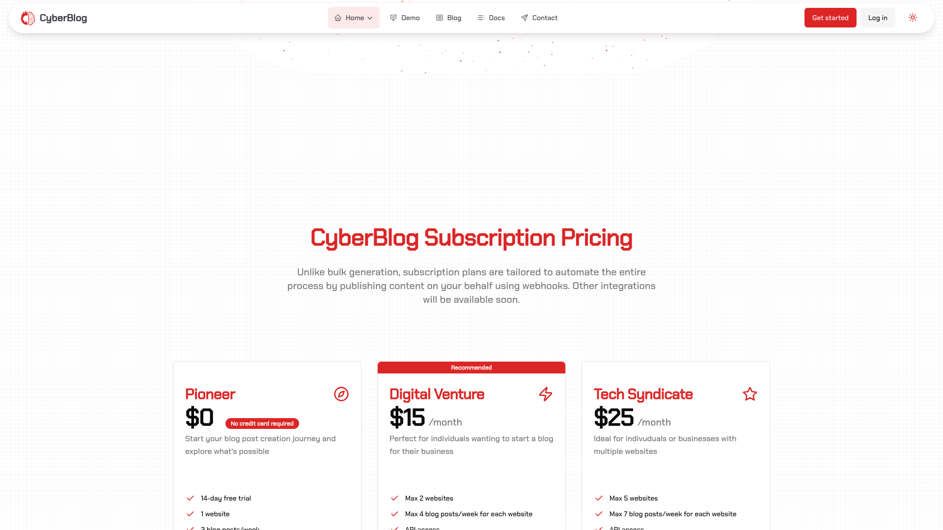
The overall design of the CyberBlog website is modern and visually appealing with a clean layout and user-friendly structure. The logo and color scheme are consistent throughout the site, which aids in brand recognition. However, the use of font weights and sizes lacks consistency in various sections. For instance, while the headings use a bold typeface, the smaller text doesn’t always maintain the same style across all pages, which can create a disjointed reading experience. Additionally, some sections appear too cluttered, particularly the pricing page, where information overload may confuse users.
colorContrast
The color contrast is well-executed across most areas of the website, making text easy to read against backgrounds. The use of red for primary actions effectively draws attention. However, some lighter text elements against pale backgrounds may create strain for users with vision impairments, suggesting a need for greater attention to accessibility standards to ensure that all users, regardless of visual ability, have a pleasant experience.
visualHierarchy
The visual hierarchy of the website is strong, with effective use of headings and subheadings to guide users through the content. The CTAs are prominently placed and visually distinct, which attracts attention well. However, some areas could benefit from additional spacing to improve readability, especially in informational sections where large blocks of text are present. It's important to achieve a balance between visuals and text accessibility.
Recommendations
Standardize font usage across the site by setting a consistent style guide for headings, body text, and other elements, ensuring uniformity in appearance and readability.
Consider simplifying the layout of the pricing page, potentially incorporating expandable sections to avoid overwhelming users with information. This will facilitate decision-making.
Create additional whitespace in heavily text-dense areas to enhance readability and make navigation intuitive, particularly for critical content sections.
Ensure that all text elements meet accessibility guidelines by testing color contrast ratios, thereby accommodating users with varying visual abilities.
Content
Evaluation of your website's content quality
Metrics Analysis
readabilityScore
The website’s content is organized and uses clear, concise language with structured headings that guide the user through the page. However, some sections, particularly those with detailed comparisons and multi-step processes, are dense and could benefit from improved text segmentation. Adding bullet points, increased white space, or concise summaries might help in enhancing overall readability further.
grammarSpellingAccuracy
The text is largely free from grammatical and spelling errors, maintaining a professional tone throughout the content. Minor issues such as occasional punctuation inconsistencies and redundant phrases were noticed but do not significantly impact the overall quality. A careful editorial review could polish these slight imperfections.
keywordUsageEffectiveness
Keywords related to AI, blog automation, SEO optimization, and content creation are well integrated into the content and meta tags. The strategic placement within headings, descriptions, and structured data enhances SEO effectiveness. However, incorporating more long-tail and semantic variations naturally within the content would further boost search performance and relevance.
Recommendations
Break up dense sections with bullet points and subheadings to improve content scannability and overall readability.
Perform a detailed editorial review to address minor punctuation inconsistencies and redundant phrases for enhanced clarity.
Integrate additional long-tail keywords and semantic variations organically into the content to further strengthen SEO performance.
Consider using visual elements such as infographics or highlights to draw attention to key points, thereby improving user engagement.
Tagging
Evaluation of your website's tagging implementation
Metrics Analysis
analyticsIntegration
The website includes a tracking script from 'https://analytics.ascent-code.xyz/js/script.js', which suggests that the site is attempting to gather user interaction data. However, there is no evidence of integrations with industry-standard platforms such as Google Analytics or Facebook Pixel. This raises concerns about the depth and reliability of the data collected. In addition, the implementation does not clearly indicate if optimizations like asynchronous or deferred loading are used, which could impact both performance and data accuracy. Overall, while a basic tracking mechanism is in place, the integration lacks the robustness, transparency, and comprehensive functionality expected by modern analytics setups.
Recommendations
Integrate with industry-standard analytics platforms like Google Analytics or Google Tag Manager. This will provide more detailed data insights and reliability for tracking user behavior.
If Facebook Pixel or other tracking tools are relevant to your business, consider adding them to further enhance audience segmentation and conversion tracking.
Optimize script loading by using asynchronous or deferred strategies to improve page performance without compromising data collection.
Conduct regular audits to verify that all tags and tracking codes are firing correctly and capturing the intended events.
Ensure the tracking setup complies with privacy regulations, and clearly document what data is collected, how it is used, and secure user consent when necessary.
User Trust
Evaluation of your website's trust factors
Metrics Analysis
testimonialQuality
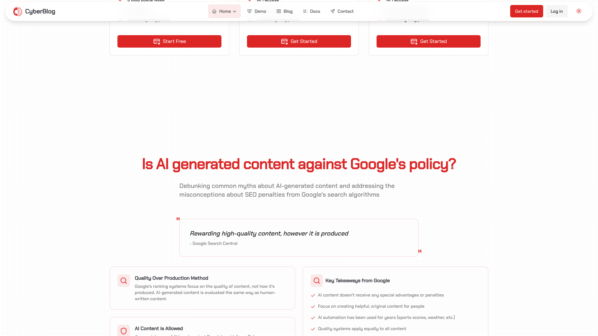
The website features a testimonial quote from Google Search Central that lends some credibility, given Google's reputation. However, the testimonial is sparse and embedded within another section rather than in a dedicated, prominent location. This singular testimonial does not provide a broad spectrum of customer feedback. Enhancing the quantity and presentation of testimonials could help build a stronger sense of trust among potential users.
securityBadgesEffectiveness
There is a noticeable absence of dedicated security badges or award symbols on the website. Although the site discusses security measures in its FAQs and content, the lack of easily visible trust signals such as recognized certifications, secure payment badges, or standard security icons significantly undermines the immediate perception of user safety. Visitors might not quickly discern that security is prioritized, which could impact their trust, especially when engaging with financial or personal data.
Recommendations
Create a dedicated testimonial section on the homepage that highlights multiple customer reviews and success stories. Use diverse formats such as text testimonials, video testimonials, or case studies to bolster credibility.
Enhance the visibility of security trust signals by incorporating clearly visible badges or icons (for example, SSL certificates, PCI compliance, or trusted third-party security seals) on critical pages like the signup and checkout pages.
Position testimonials more prominently on the landing page, pairing them with authentic customer photos or names to improve relatability and trust.
If applicable, display any industry awards or certifications in a dedicated banner so that visitors can immediately gauge the site’s commitment to quality and security.
Regularly update and curate testimonial content to ensure potential customers see fresh and relevant feedback, and consider using visual cues (such as star ratings or trust seals) to further reinforce trust.
Engagement
Evaluation of your website's user engagement factors
Metrics Analysis
estimatedTimeOnPage
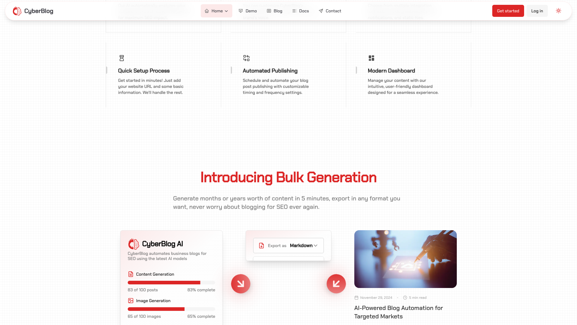
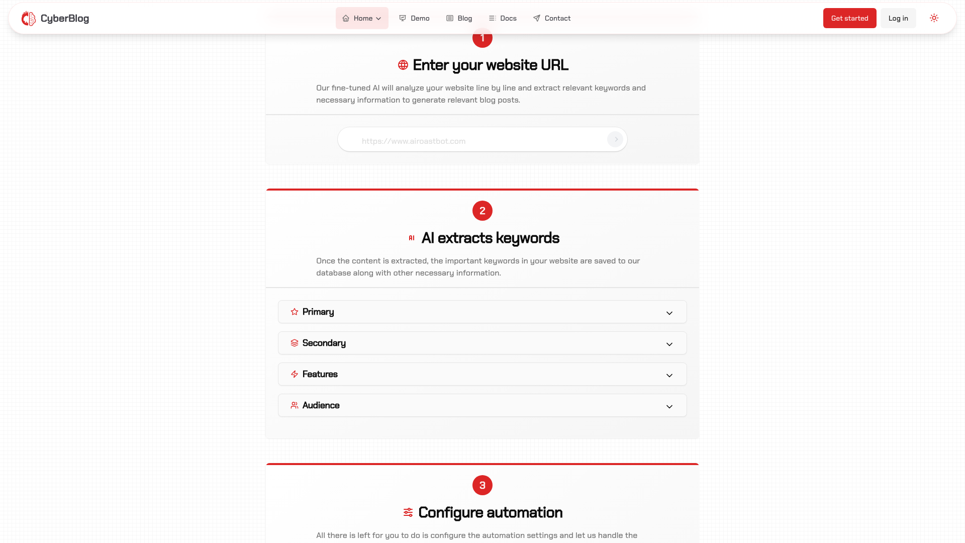
The website is content-rich and structured with multiple sections including detailed descriptions, step-by-step guides, and interactive elements. Users are likely to spend a reasonable amount of time engaging with the material due to the depth and breadth of content. However, the amount of information can sometimes be overwhelming, so fine-tuning the layout to highlight key messages can help ensure that users remain engaged throughout their visit.
bounceRateIndicators
The design incorporates clear call-to-action buttons and appealing visuals that are intended to guide users through the content, which can help lower bounce rates. However, the page’s extensive content and multiple navigation options may inadvertently cause some visitors to become distracted, possibly leading to a moderate bounce rate. Streamlining key information and emphasizing primary CTAs may help in keeping users on the page longer.
socialProofEffectiveness
The social proof elements are present in the form of a user rating (4.5/5 from 50+ users) and visual imagery of business owners, which help demonstrate credibility. Nonetheless, there is room for improvement by integrating more detailed testimonials, case studies, client logos, and trust badges. Enhancing these elements with quantitative results or specific client experiences would further build trust and boost conversion.
Recommendations
Enhance the social proof by incorporating additional detailed testimonials, client case studies, and trust badges. Adding specific metrics or quotes from satisfied users can increase credibility.
Simplify the navigation and prioritize the most important calls-to-action to reduce cognitive overload, ensuring that users can easily find the key information without getting distracted.
Optimize the layout by highlighting the most critical elements at the top of the page and using visual hierarchy effectively to guide the visitor’s attention through the content.
Consider periodic A/B testing of different content sections and CTA placements to validate which versions maintain longer engagement and effectively reduce bounce rates.
Integrate interactive elements such as brief video demos or interactive infographics that highlight the benefits of the service to further capture and maintain user attention.
Navigation
Evaluation of your website's navigation structure
Metrics Analysis
internalLinkHierarchy
The internal link structure is well-organized overall, with a clear separation between main navigation (header) links and secondary navigation in the footer. The grouping (e.g., main navigation with primary links, legal links in the footer) aids users in quickly locating relevant sections. There is some redundancy in duplicate links, and while the hierarchy is generally consistent, additional visual differentiation (such as grouping calls to action distinctly from navigational links) could further enhance usability for both new users and returning visitors.
navigationMenuClarity
The navigation menu is mostly clear and provides access to key sections such as Home, Demo, Blog, Docs, and Contact. The use of a header menu accompanied by CTAs like 'Get started' and 'Log in' enhances its utility. However, there are areas for refinement: the duplication of certain CTAs across multiple parts of the interface (header and repeated links later on) can create a slight cognitive overload. Furthermore, while the mobile navigation toggle is present, its functionality and labeling might benefit from clearer visual cues to improve accessibility and ensure that users immediately understand its purpose.
Recommendations
Simplify and consolidate duplicate call-to-action links to reduce clutter and potential user confusion, ensuring that each action is clearly differentiated.
Enhance the mobile navigation toggle with more descriptive labels or visual cues, possibly using icons alongside text to improve discoverability and accessibility.
Implement additional visual hierarchy cues (such as varied font weights, sizes, or color differences) to further distinguish between primary navigation links and secondary or legal links.
Conduct user testing specifically on mobile interfaces to ensure the toggle and all navigation elements perform intuitively, and iterate based on feedback.
Performance
Evaluation of your website's loading performance
Metrics Analysis
totalLoadTime
With key indicators like a Largest Contentful Paint of 4139 ms and a Time to Interactive of 4223.6 ms, the overall page load is slower than optimal. The Speed Index of 5641 ms indicates that users are waiting a significant amount of time before the page content visually stabilizes. Optimizing image loading, compressing assets, and deferring non-critical scripts can help lower the total load time and improve perceived performance.
timeToFirstByte
The server’s response time of 310 ms is respectable but leaves room for improvement. Ideally, a TTFB closer to or below 200 ms is preferred for a snappier server response. Consider reviewing server-side caching strategies and backend performance optimizations. Even modest adjustments like better resource allocation or using a CDN could result in noticeable gains, reducing the TTFB further.
waterfallBreakdown
The resource waterfall reveals multiple areas for optimization. There are several flagged opportunities including duplicate JavaScript, unminified scripts and CSS, legacy JavaScript issues, and render-blocking resources. These issues contribute to inefficiencies in the order and speed of resource loading. A thorough audit followed by consolidating, minifying, and deferring non-essential scripts and resources can streamline this process and directly improve performance.
mobileResponsiveness
Mobile responsiveness is moderately well-optimized, benefiting from high scores in accessibility and best practices. However, there is still potential for improvement. On mobile, network conditions are often less reliable, making optimizations like lazy-loading offscreen images, deferring non-critical resources, and using preconnect/dns-prefetch hints even more crucial. Addressing these factors will not only improve load times on mobile devices but also enhance the overall user experience.
Recommendations
Optimize server configuration and implement effective caching strategies to drive down Time to First Byte.
Focus on reducing total load time by compressing and minifying JavaScript and CSS, and by deferring non-critical scripts.
Audit the resource waterfall to consolidate and streamline asset loading, addressing issues with duplicate modules, legacy scripts, and render-blocking resources.
Adopt modern image formats (e.g., WebP, AVIF) and implement responsive image strategies to reduce load times and data usage, particularly on mobile.
Utilize preconnect and dns-prefetch hints to establish early connections to critical third-party resources, enhancing mobile and overall page performance.
Outbound Link
Evaluation of your website's outbound links
Metrics Analysis
linkedContentQuality
The quality and relevance of the linked content is very high. By directing visitors to the Google Search Central Blog, the site links to an authoritative, trustworthy, and industry-relevant source. This external reference is highly beneficial for both SEO purposes and offering users credible information. However, given that this is the sole external outbound link, there could be an opportunity to diversify and add more high-quality references to further enhance content depth and perceived authority.
outboundLinkValidity
The website features outbound links with strong validity characteristics. The single external link—the one directing users to the Google Search Central Blog—is correctly implemented with proper attributes (target set to _blank, rel attributes ensuring security) and is clearly valid. This ensures that search engine crawlers and users are directed properly, minimizing any risk of broken or misdirected links. Overall, the outbound links are reliable and contribute positively to the site's connected ecosystem.
Recommendations
Consider incorporating additional outbound links to other reputable and relevant sources in the industry. This can further enhance the website’s authority and provide more comprehensive resource options to your users.
Regularly check the validity of outbound links to ensure they remain functional and correctly formatted, especially if linking to third-party content that may change over time.
Ensure all external links maintain security best practices (such as using target=_blank with rel='noopener noreferrer') to protect against potential vulnerabilities.
Periodically review linked content to verify its relevance and update or replace any that may become outdated, ensuring continuous enhancement of user experience and SEO performance.
Accessibility
Evaluation of your website's accessibility features
Metrics Analysis
ariaRoleUsage
ARIA attributes are utilized effectively throughout the site. Elements such as navigation and dialogs include proper aria-labels, aria-haspopup, aria-expanded, and aria-controls attributes. This helps in providing a rich accessible experience. Nonetheless, a few components could benefit from additional ARIA role definitions or landmarks to bolster clarity, particularly around dynamic content changes.
contrastRatio
Based on the provided data, the site appears to use a modern design that likely meets many contrast standards. However, without explicit contrast ratio measurements it is harder to determine the exact compliance level. A deeper analysis using automated contrast ratio tools is recommended to ensure that text and interactive elements meet the minimum accessibility contrast ratios.
altTextQuality
The website does a good job of including alt texts for images, with all seven images having descriptive alt attributes. The alt texts for images like 'Business owner using CyberBlog' are clear and descriptive, and the opengraph images also include alt text. However, there is some room for improvement by providing even more contextual information where needed, especially for images that serve a more decorative or branding function, ensuring that all users receive the full context of the image content.
keyboardNavigation
The interactive elements such as buttons, links, and form inputs are naturally keyboard accessible, and the use of semantic HTML supports keyboard navigation. However, the absence of a dedicated skip link for bypassing repetitive content can be a hurdle for keyboard-only users and screen reader users. Adding visible and functional skip navigation options would enhance the overall keyboard experience.
Recommendations
Implement a skip link at the top of the page to allow users to bypass repetitive navigation links for a smoother keyboard navigation experience.
Enhance some alt texts by adding more contextual or descriptive details, especially for images that are key to understanding the page content.
Review and possibly expand ARIA role definitions around dynamic sections to ensure that changes are announced appropriately by screen readers.
Conduct a detailed contrast ratio analysis using automated tools to identify any areas where text or interactive elements may fall short of WCAG guidelines, and adjust color schemes accordingly.
Continuously test accessibility features with real users and assistive technologies to catch any issues that automated scans might miss.
Domain Authority
Evaluation of your website's domain authority
Metrics Analysis
domainAuthorityScore
The data reveals an extremely low overall domain authority with a score of only 5. This suggests that the website is struggling to earn trust from search engines. The extremely weak domain authority is reflected in other related metrics like page authority (16) and a low number of quality root domains linking to the site. These metrics indicate that the domain currently lacks significant influence in its niche, which could hamper organic search performance and overall credibility.
externalTrustMetrics
The external trust metrics show that while there is some volume in external pages (for example, over 10,000 external links to the root domain), the overwhelming majority are marked as nofollow links. With only a handful of follow links and just 5 to 18 root domains providing them, the quality and impact of these backlinks appear minimal. The dominance of nofollow links suggests that the natural authority signal from these backlinks is very weak. In addition, having a spam score of 11 further raises concerns about the backlink profile’s overall quality and trustworthiness.
Recommendations
Develop a targeted outreach strategy to build high-quality, follow backlinks from reputable websites in your industry. This could include guest posting, partnerships, and active engagement in community forums.
Audit your current backlink profile to identify and disavow any potentially harmful or spammy links. Focus on improving the ratio of follow links to nofollow links where appropriate.
Enhance on-page content by creating valuable, authoritative content that naturally attracts quality links over time. Consider investing in content marketing and promotional campaigns to drive organic links.
Implement a proactive digital PR strategy to secure mentions from established publications and influencers, which can yield more authoritative backlinks.
Review and improve your website's technical SEO and user experience to ensure it is well-structured and accessible to search engines, thereby making it easier for quality sites to reference your content.
Conversion Funnel
Evaluation of your website's conversion funnel
Metrics Analysis
formQuality
The website contains a minimal set of forms – notably a search input and a URL submission form within the 'How It Works' section. While these forms are straightforward and follow a simplistic design, they lack rigorous labeling and unique identifiers which could enhance accessibility and clarity. The visual appeal is satisfactory, but the form layout does not fully encourage conversion since there’s limited guidance on what actions to take. Improvements such as integrating more direct, conversion-oriented forms (for example, dedicated sign-up or trial request forms with clear labels and error messaging) could boost user engagement.
dropOffPoints
While the overall design funnels users effectively toward conversion actions, there are potential drop-off points that could be improved. The excessive number of links and buttons scattered throughout various sections may cause decision fatigue. In addition, forms such as the search input could distract rather than aid the conversion process if not integrated with clear follow-ups. The FAQ and detailed technical information, while valuable, could also detract from the main call-to-action if a user’s intent is to sign up quickly. Addressing these issues by prioritizing the primary conversion journey will likely reduce drop-offs.
landingPageFlow
The landing page is well-structured and visually balanced, with clear headers, concise sub-sections, and a logical progression that guides the user from product introduction to conversion points. The interface is clean and intuitive, and the multiple call-to-action buttons (e.g., 'Start Free Trial', 'Get Started') are strategically placed throughout. However, there is potential for slight information overload as the abundance of options might confuse some visitors. Streamlining the flow and emphasizing a clear primary conversion path could further enhance the user experience and boost engagement.
Recommendations
Redesign form elements to include unique identifiers and more targeted calls-to-action (e.g., dedicated signup or trial forms) to improve clarity and accessibility.
Simplify the landing page by reducing redundant links and consolidating multiple CTAs into a clear primary conversion path, thereby reducing decision fatigue.
Implement A/B testing on various elements (button placements, form designs, and content hierarchy) to identify and improve underperforming areas in the conversion funnel.
Enhance mobile and accessibility features to ensure that form interactions and CTAs are optimized for all devices, reducing potential drop-off points.
Image Optimization
Evaluation of your website's image optimization
Metrics Analysis
imageAltTextQuality
Most images have clearly defined alt texts that describe content like 'Business owner using CyberBlog' and the open graph image alt text is descriptive. While this is good for accessibility and SEO, there is room for improvement by ensuring each image uses context-specific and unique alt descriptions, thereby avoiding repetition. Enriching the alt attributes with more detailed descriptions can enhance accessibility for screen readers and provide more context for SEO.
imageFileSizeOptimization
The website utilizes advanced image loading techniques by employing Next.js's <image> components, which manage lazy loading and compression, ensuring that images load quickly on various devices. The webp format is used effectively with quality set at 75, and dimensions are provided. However, file size details are not explicitly reported, so further checks and potential optimization through modern compression tools or a CDN integration could fine-tune performance even more.
responsiveImageTechniques
The site strongly leverages responsive image techniques, particularly by making use of srcset and sizes attributes. These implementations serve multiple device resolutions effectively and ensure that images are delivered in the appropriate size and quality. The practice is aligned with modern web standards and helps in minimizing unnecessary bandwidth consumption on smaller devices. Minor improvements could be further optimizing sizes attribute and verifying actual served file sizes.
Recommendations
Implement a detailed audit of image file sizes using a dedicated performance tool (e.g., Lighthouse) to identify any potential over-compression or unoptimized assets.
Enhance alt text descriptions by making them unique and context-specific, which would improve accessibility and SEO by providing richer details for each image.
Consider using an advanced CDN with automatic image optimization to dynamically serve the best image size based on the viewer's device, further reducing load times.
Regularly monitor responsive image performance and adjust the srcset and sizes attributes as needed to ensure optimal delivery on emerging device resolutions.
Website Screenshots
Full-size captures of your website (1920x1080)